So much data! Such a beautiful map!
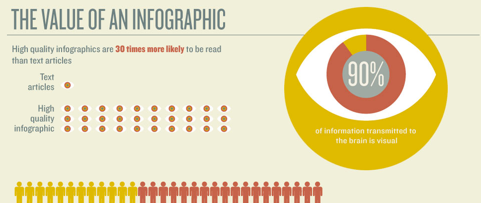
Infographics are no fad: the ability to pack a lot of useful data in a small amount of space, and make it fun to learn something or visualize complicated concepts in a fresh way is eternally useful.
Here’s a roundup of some great infographics we’ve encountered recently:
Warby Parker’s fun, informal, and informative annual report is an innovative approach to the often stuffy formality, and also provides information you never thought you cared about in a dynamic web interface.
Cute and fun: Drake Martinet’s marriage proposal.
Sometimes infographics are less design challenges than data ones. Here’s an example of a ton of data integrated into a map, making a tool that is useful and visually impressive at both the macro- and micro-level.
Infographics can pack tons of personality and information into what might otherwise be unremarkable promotional pieces.
And if you’re a Pinterest user, there’s a never-ending waterful of amazing infographics to peruse and get inspiration from. Here’s a good place to start.
Let us know if you’ve got a challenge that creative visualization might be able to tackle.

