by OnSight | May 2015 | politics
Congratulations to Denver City Councilman Albus Brooks for a running a great race and being elected to serve another four years for District 9. OnSight knows Albus is focused on making our neighborhood the best place to live, work, and connect, and we’re proud to support his efforts!
by OnSight | Dec 2014 | Campaign, politics, Press and Media, Print Communications, video, Web Communications
What do farmers markets, pumpkin carving, fog machines and smokestacks have in common? All were utilized by the OnSight team in the name of bringing climate change to the forefront for Colorado voters. This past fall, OnSight teamed up with NextGen Climate Colorado with the goal of making the issue of climate one of the top issues voters consider at the polls. How? By attracting earned media, organizing a stunt or two, and packaging creative content.
Over the course of nearly four months, the communications team was able to introduce and establish NextGen Climate with Colorado’s press corps, create an online presence and produce a steady stream of social media, blog content and videos, and develop and deliver localized messaging in regards to the 2014 senate race. During this time, the NextGen Climate Colorado team was able to establish itself as a serious player in Colorado politics and regularly influenced questions asked of candidates during debates and in coverage altogether. On multiple occasions outlined below, the team rose above the campaign season noise to receive earned-media attention amid stiff competition for coverage — notably during the Denver EPA hearings, the Club 20 Debates, with Cory Gardner’s House of Deception which coincided with Michelle Obama’s visit in Fort Collins, and the placement of the state director’s op-ed in the Denver Post.
Here’s a look at some of our favorite for NextGen Climate Colorado:
Videos:
News Clips:
9News: EPA hearings turn Denver into political stage
Denver Post: Demand candidates take action on climate issues
by OnSight | Nov 2014 | Elections, politics, Web Communications

Search for drop box locations near you.
You can vote today or up until 7 pm tomorrow at a Voter Service Center near you!
Important notes:
- Vote your ballot and drop it off, it’s too late to mail
- Drop off your ballot before 7 p.m. Tuesday; late ballots will not be counted
- Find all drop off locations for your county at www.MyColoradoVote.com
- Check out convenient new 24/hour ballot drop boxers and drive-up drop boxes in some counties
If you don’t have a ballot or made a mistake and need to fill out a new one — even if you’re worried you’re not even registered! — you can visit a Voter Service Center all the way through 7 pm on Election Day to register and fill out a ballot. Find the closest Vote Center to you at www.MyColoradoVote.com.

by admin | Sep 2014 | politics, press, social media, technology
Scads of small type. Truncated graphics. Unusable forms. Browser-crashing incompatibility.

On the right, a site not optimized for mobile — tiny, cut-off text, pics that have to be zoomed-in to see, and tiny, cluttered menu. On the right, clear navigation, mobile-friendly text, and clear calls to action.
On the right, a site not optimized for mobile — tiny, cut-off text, pics that have to be zoomed-in to see, and tiny, cluttered menu. On the right, clear navigation, mobile-friendly text, and clear calls to action.
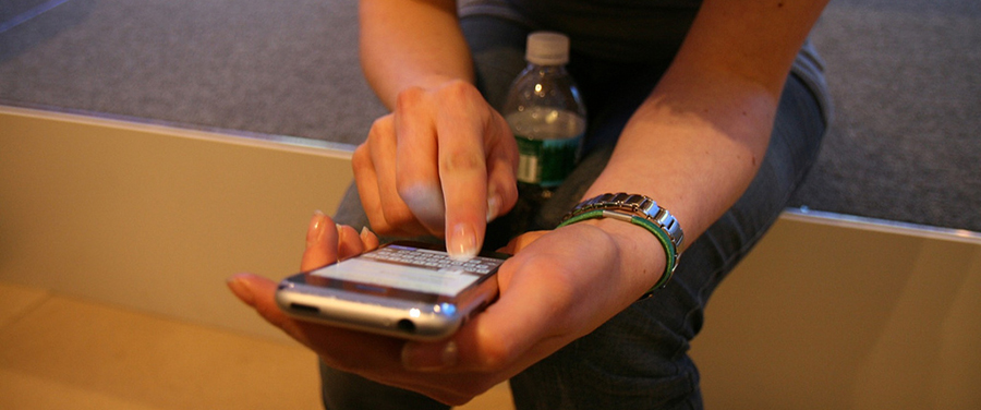
There are people looking for you — wanting to learn more, wanting to volunteer or even donate to you campaign or cause. And more and more (maybe even up to 50% of the time) they’re using their mobile phones to do it.
Not sure if your web site is mobile-compatible? Don’t feel too terribly bad — turns out some of the major political campaigns are behind the curve, too.
From Politico:
A POLITICO analysis of mobile sites for about 40 competitive House and Senate races found that a majority were plagued with missed opportunities for campaigns trying to find volunteers, donors and voters. The no-nos range from clunky pages that frequently crashed or weren’t formatted properly to content that was just too tiny to read.
Another big problem often discouraged by some political consultants: multiple pages of navigation before a potential donor can hit the send button with their all-important credit card numbers.
…
Political operatives from both parties say they recognize mobile’s tantalizing possibilities. Still, many campaigns are cutting corners on the mobile front — ignoring pleas for fewer tabs or larger font sizes — even if the potential payoff could mean more votes or thousands of dollars in additional donations. They’re reluctant to shift limited budget dollars away from traditional TV ads, especially for innovations that have a short shelf life limited to this election season.
To digital campaign strategists, seeing the shortcomings on the mobile front makes little sense considering how Americans have come to obsessively use their phones as their primary source not just for daily communication but also for entertainment.
Read full article
Most users don’t want to read lots of text online at all, and even less so on mobile. And most campaigns can’t spring for the coding and development for a full mobile site, custom forms, and the tools required for credit card processing.
That said, if people are looking for you on their phones — and they are — there’s no excuse for making sure they can find you.
The priorities:
- Using web analytics, determine what portion of your audience is accessing your site via mobile.
- Are there particular times of week or year when mobile usage spikes?
- Is there particular content that mobile users access more than desktop users?
- Can your donation form be simplified or otherwise optimized for mobile?
- Homepage should always be legible in mobile!
All this information inform the urgency and priorities for building out mobile compatibility.
After tackling the minimum, you can further refine your mobile site with custom content for mobile pages (shorter, more tightly-drafted content and photos), custom graphics and features to more closely mimic your desktop-viewable web site, other bells and whistles to integrate with social and other mobile-friendly tools.
Cover photo from Flickr.com/marcoarment
by OnSight | Sep 2014 | politics, Press and Media, Social Media, Trends
Scads of small type. Truncated graphics. Unusable forms. Browser-crashing incompatibility.

On the right, a site not optimized for mobile — tiny, cut-off text, pics that have to be zoomed-in to see, and tiny, cluttered menu. On the right, clear navigation, mobile-friendly text, and clear calls to action.
There are people looking for you — wanting to learn more, wanting to volunteer or even donate to you campaign or cause. And more and more (maybe even up to 50% of the time) they’re using their mobile phones to do it.
Not sure if your web site is mobile-compatible? Don’t feel too terribly bad — turns out some of the major political campaigns are behind the curve, too.
From Politico:
A POLITICO analysis of mobile sites for about 40 competitive House and Senate races found that a majority were plagued with missed opportunities for campaigns trying to find volunteers, donors and voters. The no-nos range from clunky pages that frequently crashed or weren’t formatted properly to content that was just too tiny to read.
Another big problem often discouraged by some political consultants: multiple pages of navigation before a potential donor can hit the send button with their all-important credit card numbers.
…
Political operatives from both parties say they recognize mobile’s tantalizing possibilities. Still, many campaigns are cutting corners on the mobile front — ignoring pleas for fewer tabs or larger font sizes — even if the potential payoff could mean more votes or thousands of dollars in additional donations. They’re reluctant to shift limited budget dollars away from traditional TV ads, especially for innovations that have a short shelf life limited to this election season.
To digital campaign strategists, seeing the shortcomings on the mobile front makes little sense considering how Americans have come to obsessively use their phones as their primary source not just for daily communication but also for entertainment.
Most users don’t want to read lots of text online at all, and even less so on mobile. And most campaigns can’t spring for the coding and development for a full mobile site, custom forms, and the tools required for credit card processing.
That said, if people are looking for you on their phones — and they are — there’s no excuse for making sure they can find you.
The priorities:
1. Using web analytics, determine what portion of your audience is accessing your site via mobile.
2. Are there particular times of week or year when mobile usage spikes?
3. Is there particular content that mobile users access more than desktop users?
4. Can your donation form be simplified or otherwise optimized for mobile?
5. Homepage should always be legible in mobile!
All this information inform the urgency and priorities for building out mobile compatibility.
After tackling the minimum, you can further refine your mobile site with custom content for mobile pages (shorter, more tightly-drafted content and photos), custom graphics and features to more closely mimic your desktop-viewable web site, other bells and whistles to integrate with social and other mobile-friendly tools.
cover image from Flickr user /marcoarment
by OnSight | Apr 2014 | Campaign, Hickenlooper, politics, video
The Hickenlooper for Colorado 2014 campaign is up and running! We worked with our friends at Putnam Partners to create a fun new video showing off John Hickenlooper and Joe Garcia’s campaign workout routine as they get ready for 2014. It was first screened to cheers and laughter at the Democratic Party Assembly on Saturday. From cycling around the state, to meeting thousands of Coloradans, and not to mention answering countless phone calls, all of Team Hickenlooper is busy getting ready for the campaign!
Lynn Bartels mentioned the video in a post on The Spot, and with hundreds of views on YouTube and dozens of shares on Facebook, the video is already launching the campaign into the spotlight with its characteristic positivity, energy, and self-deprecating charm.


